


Utilising data to create great user experience



Data is a tool that you should be using
As an agency, we pride ourselves in using data to make informed decisions on everything we do, from design and build to marketing. Looking at our user data allows us to enhance our user experience (UX). Metrics such as bounce rate, on-page conversions or time spent on pages give us a pretty good indication of UX and how it can be improved for our clients and our website. Our designers work to create something that is ideal for the purpose of users on that website with the target audience in mind. How can this be achieved? Metrics are the perfect tool for helping clients align closer with their business goals! Data is a key resource to help you sharpen your instincts about users.
Data day-to-day
How can you utilise data on a daily basis? The most important part of using data is determining when to incorporate data into your decisions, and when data doesn’t matter. By using tools such as Google Analytics it can easily help you see how your UX choices impact on user behaviour. If you are thinking about testing a new design idea, always be sure to use metrics to compare results. Design idea changes can be anything from changing the colour scheme and typography to making it easier to read or adding in more calls to action.
The Studio44 Example
Design 1
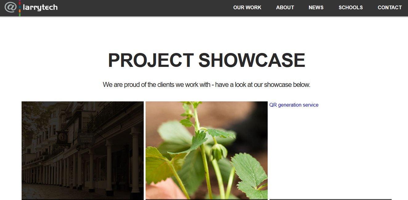
Design 2
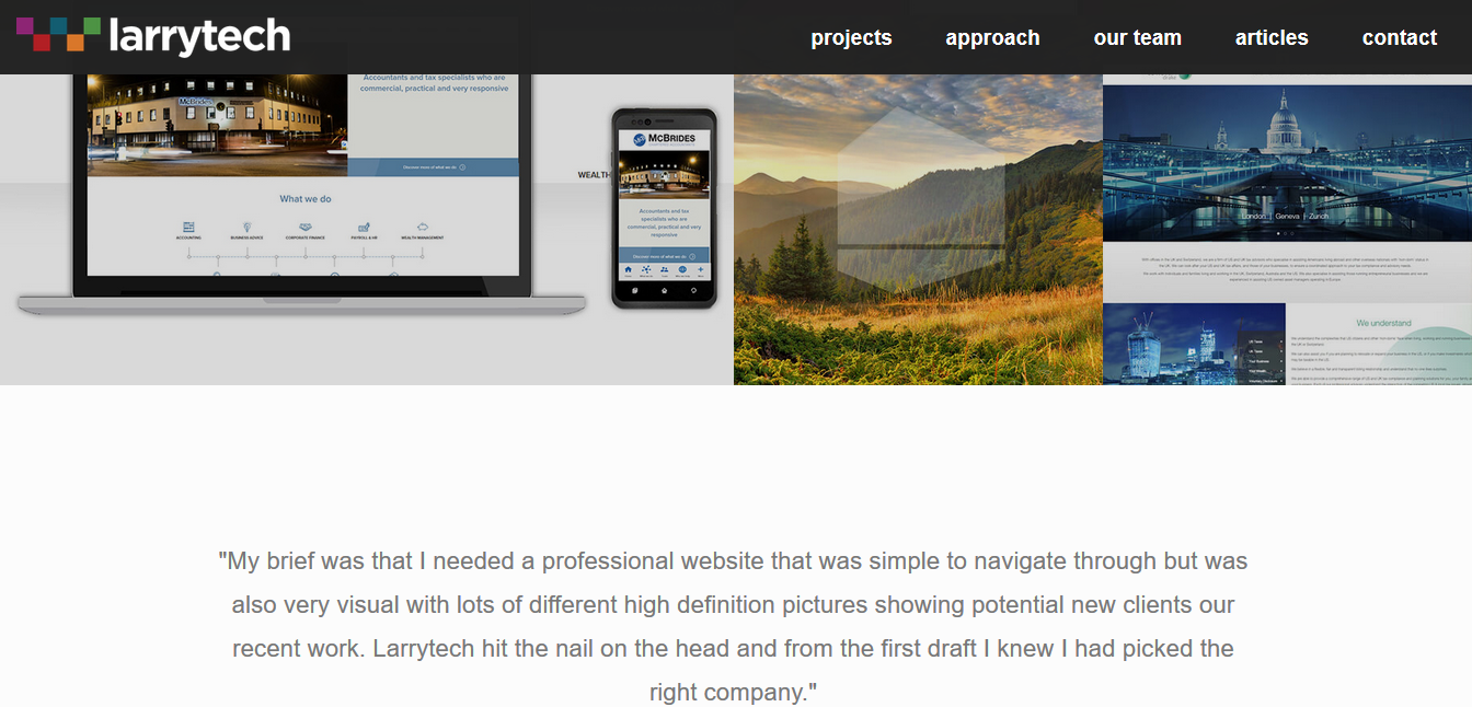
Design 3
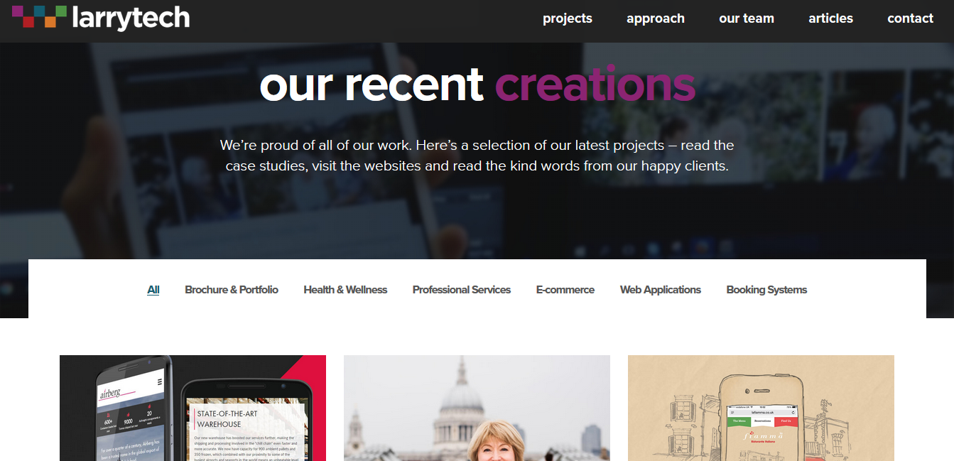
In the light of data, a particular part of our website that we have always tried to remain at the forefront of our marketing is our projects page. Through our original design data showed that users weren’t going on to the next phase of the user journey and instead were clicking off the projects page. We determined the page lacked insightful information to help the user narrow down their search to find projects that were applicable to them. Data showed a lack of user engagement, so to aid that we transitioned into design 2. Incorporating more content when users hovered over a project made it easier for users to find what they were looking for and resulted in more active engagement with case studies. We wanted to categorise the projects page to help users narrow down their search more easily, so we transitioned into design 3. Design 3 focussed on a cleaner UX with a new design concept for navigational purposes. The design worked to combine compelling imagery with concise content so that users could visually process and read the projects more easily.
Using data to improve accessibility as well as UX, means that we’re continually tailoring our site for our users. We also work closely with our clients to help them identify, measure and analyse data to achieve all types of outcomes from marketing all the way to new design ideas. If your website isn’t generating the conversions you require, or your bounce rate is high, come and have a catch up with us today and we can discuss a solution!


