


Striking parallels: The Correlation between Architecture & Digital design



Nowadays, technology is advancing at a rapid pace. Architecture is now using large panels of glass, asymmetrical concrete structures, high performance materials, and CAD engineering to name a few. Similarly, web design now has responsive design which allows you to consult your favourite website on a variety of different media, smartphones, computers, tablets etc. Content Management System (CMS) makes editing your website everyday much simpler, SEO tools are more efficient and accurate, which optimises a campaign or the ranking of your website. Both architecture and web design share principles such as: transparency, light and shadow, structure, negative space.
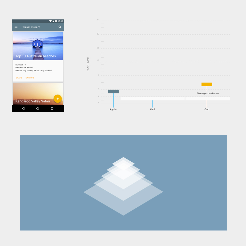
Quick throwback in time
During the 19th and 20th century, modernism started ruling the world of design. Due to a new economic system, demand for new structures and the evolution of engineering, we saw the birth of new volumes and geometry. Modernism rejects the classical and fundamental principles of architecture (such as Victorian, Edwardian, Haussmannian architecture). Modern design = functional and refined. It aims for simplicity and purpose. Guess what… it is the same for digital design! In the early 80s when the internet was born we saw the first websites that took the same path as architectural design and evolved quickly to what we have now.

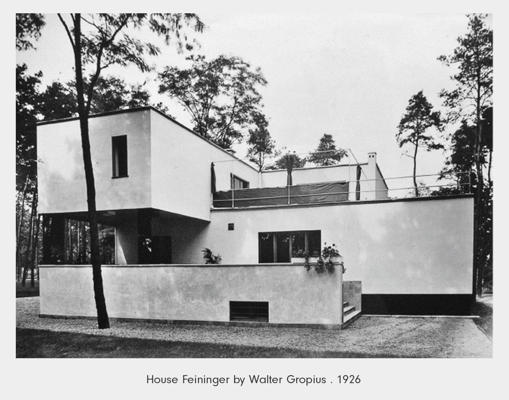
Bauhaus is an art movement that was founded by Walter Gropius (architect) in 1919 in Germany. The meaning of Bauhaus is “building house”. Bauhaus had a profound influence upon subsequent developments in art, architecture, graphic design, interior design and industrial design. Constructivism has also been a key factor. Usually constructivists build (they do not create) abstract pieces made of precise geometrical shapes and pure colours.
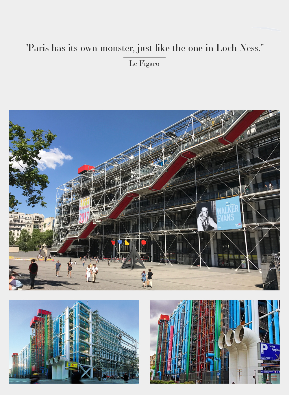
One of the most “marmite” designs in the world is le Centre Pompidou in Paris designed by Richard Rogers and Renzo Piano. Inaugurated in 1977 le Centre Pompidou is a mix of playful and high tech design. Its iron structure stays visible just like an exoskeleton. Escalators run along the front of the building in transparent plexiglass tubes. All the outdoor coloured pipes have a purpose: blue for the air conditioning, yellow for electric wiring, red for the lifts and security.
“Form ever follow function” - Louis Sullivan
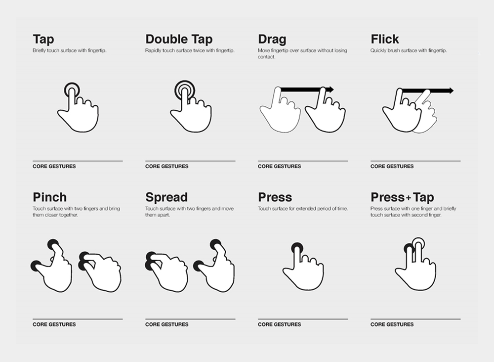
Let’s go back to web design and look at Google and Apple, they are good examples of websites that have evolved. In 2007 Apple’s website changed to become simpler with full width images, big headings and more negative space. This could be interpreted as following the Modernism movement as mentioned above. Since 2007 this style has been even more minimalistic and has been named ‘Flat design’. Flat design had to adapt to the new needs with the creation of social networks, streaming platforms and e-commence. Because of this rapid growth we have had to redefine our use of the tools to suit our needs and the progress of technology. This evolution has redefined user interaction with some new gestures such as Pan-zoom, double tap, zoom and gyroscope for VR, for example.
Skeumorphism VS Flat design
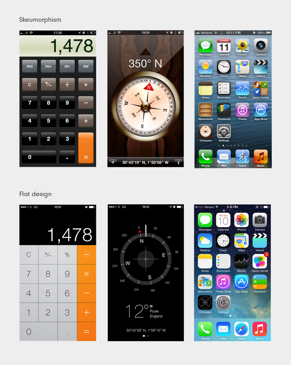
Skeumorphism, what a word. It is how an object from the real world has been mimicked and examples include the bin icon on your desktop and the iOS calculator. One of the most obvious examples of the disadvantages of skeuomorphism can be seen in the analogue clock on your screen which tends to be difficult to read because of the size and effects added to it. Before flat design, we used to use a heavy drop shadow to mimic a button, a colour gradient for reflection or rounded buttons. Flat design is more than a trend as it corrected the functionality issues encountered through Skeuomorphism.
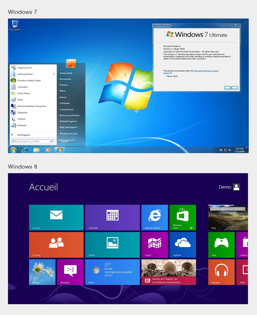
Later with the transition from Windows 7 to Windows 8, roundness, effects and textures have been replaced with bold shapes, single tone colours and all the ornamentation has been removed as per the Victorian era and Modernism. Just as with Modernism, Flat design demands that structure match function like the desire to break away from historical style and the willingness to be purely functional.
“Modern decorative art has no decoration”. Le Corbusier
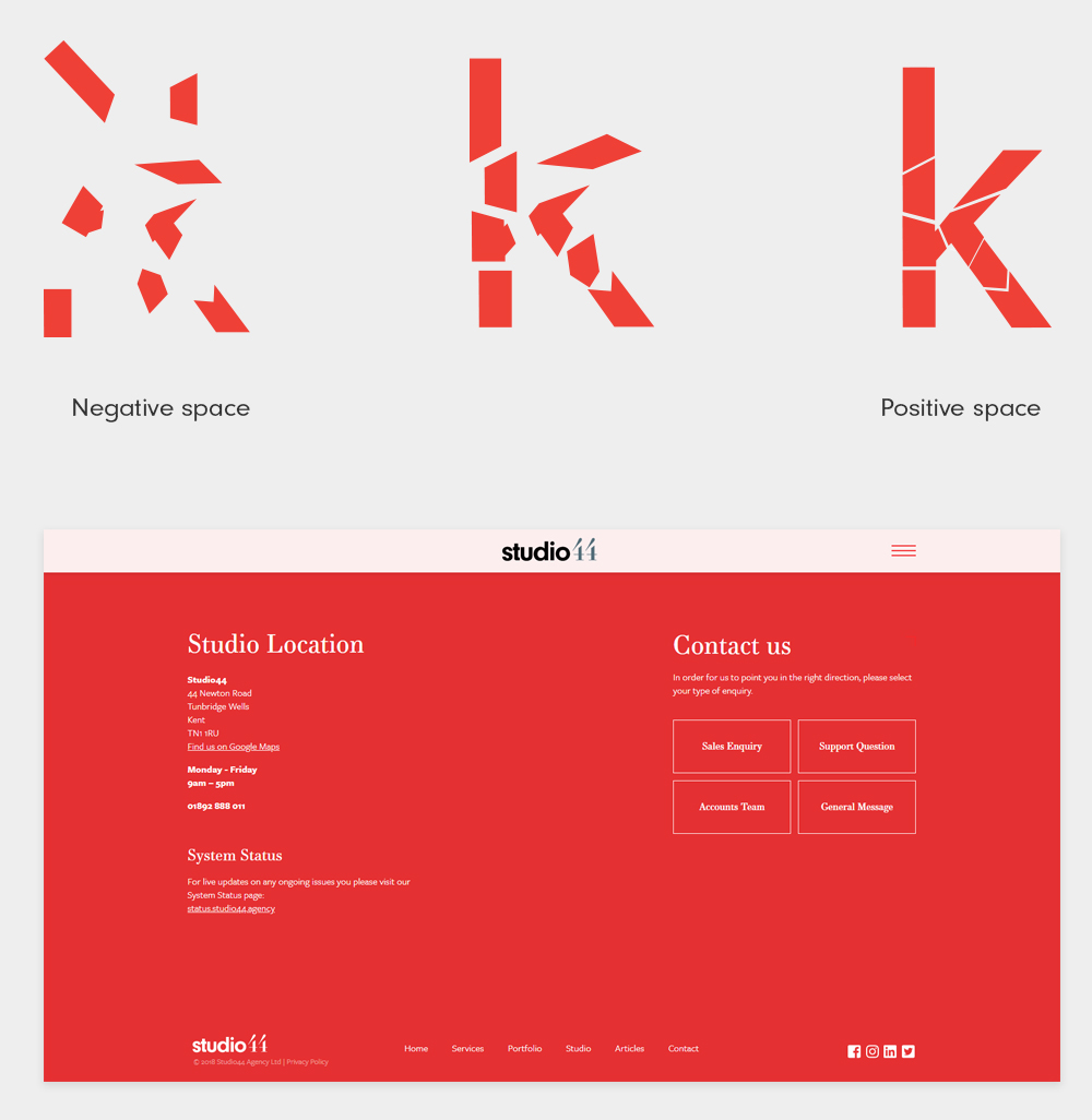
Clarity and simplicity are key, an efficient website has call to action buttons that are more prominent, full width images, a simplified navigation. Another key element is negative space as previously explained by Will, space is called negative space if it is unshaped after the placement of elements but it becomes positive after all these elements are shaped. As per architecture, we move through negative space and dwell in positive space. This principle is definitely applicable for the web too. In a website having some empty space allows the user to digest the content and makes the website feel easier to navigate because of these breathing spaces.
Both Architecture and Digital design have a lot in common. Both are affected by the needs of modern society but also the deployment of new technology. Interaction, accessibility, space and purpose are fundamental, without them we would be lost. In the case of a website, we would probably leave a website without any further interaction or conversion. In the case of a building, we would have slammed the door shut and run away from the maze!
For any help on how to make your website different and stand out from the crowd, do not hesitate to get in touch with us!


