The first 30 years were random and were called “the parabola phase”, a period with a lack of consistency where the crane and lettering were the only constants. Lufthansa used several illustrators and each of them branded the company with their own touch. This created a “joyeux bazar” of advertising with no consistent standards whatsoever.

1955 saw the birth of “Lufthansa Advertising Elements”, Lufthansa’s first attempt at making their brand homogeneous and creating some rules with some design constants in one and unique book… but nobody knows if anyone really used this bible.
1963 — FINALLY! Lufthansa published an official guideline where any use of Lufthansa’s identity was standardised. Welcome to clear rules and brand guidelines.
Here we are as per 55 years ago, Lufthansa is once again proving controversial. When Lufthansa released their new company aesthetic in 1963, general opinion was divided. The main criticism was about the logo. Why? Because for the first time the crane was captured in a golden, sun coloured circle and gave a notion of restriction, whereas before the crane was flying in total freedom. Probably a bold move for this period but brilliantly executed by Otl Aicher and it fast tracked Lufthansa’s identity onto the highest steps of 20th century design. So why in 2018 is Lufthansa back in controversy? Here is why
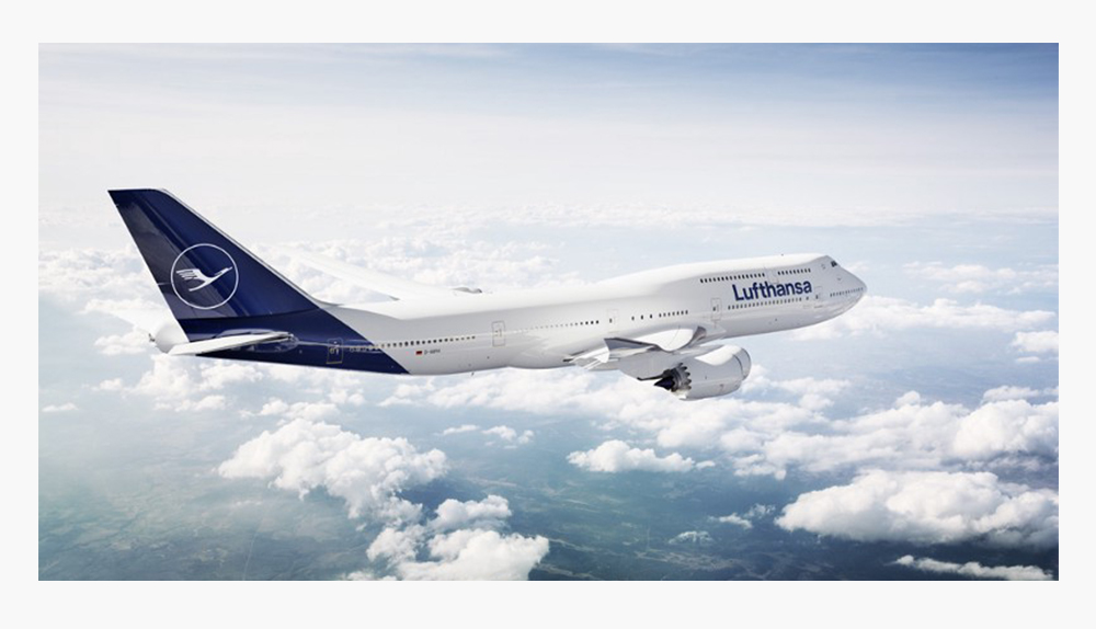
“Firstly I was excited about this brand update, a bit like when you buy your car and you see it for the first time in the showroom, glorious under the spotlight, shiny and immaculate… but after a few days and you see your brand new car in a genuine car park in the middle of other cars… well it is not amazing anymore”
Goodbye yellow and hello stunning, deep, rich blue and white. A bland change and a descent in the dictatorship of minimalism? We can agree with this, the dominant colours in airline companies are red, blue and… YES white. The “Lufthansa Yellow”, this striking hue of yellow that makes the company highly recognisable and introduced in the 60’s by Otl, is no longer. Well no, not really, the yellow has now been relegated to the secondary colour to serve as a means of orientation & differentiation (boarding pass, airport counter…).
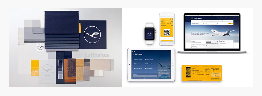
Lufthansa aimed to be more premium than they are now. Even if the form stays basic the content and message become dated as Alexander Schlaubitz explained. Font wise some changes occurred too, the Helvetica Black has been slightly customised for the best. A little wider, curvy “f” and “t” the letter “s” is more horizontal, some discreet changes but major improvement into the logo consistency.
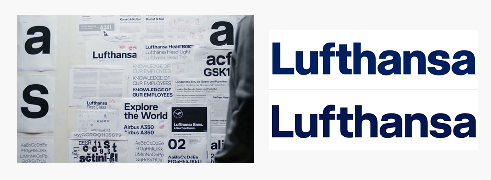
“What was done in the past was the optimum at the time, but for the present, it’s no longer the optimum”.
Nevertheless, some other changes occurred. The crane is now slimmer for a better fit in the digital world but stays as a symbol of excellent service and flying expertise. The circle has been victim to a drastic diet too, making the logo lighter and more elegant.
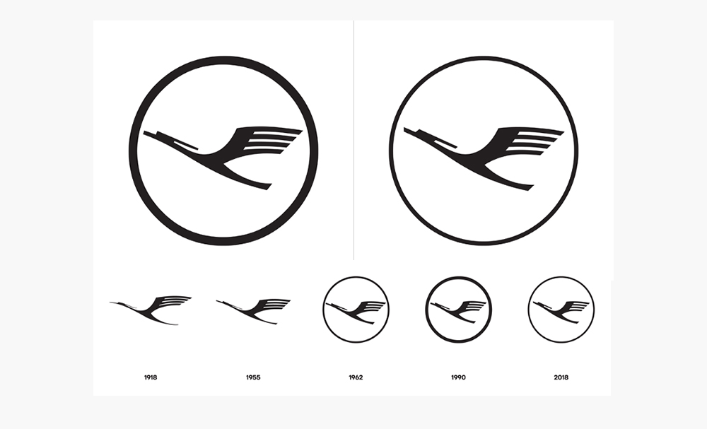
Is it the end of an era? The overall feeling that Lufthansa tries to share is modernity, high quality, reliability and innovation. Sadly, there is less competition between airlines so there is no need to stand out. Also, the global economic climate reduces design for practicality (light colours reflect heat) and cost efficiency. Do not get me wrong, I am someone who likes minimalism, but in the case of a strong graphic legacy such as Lufthansa, I considered it a waste of potential at the start but the evolution and the new direction Lufthansa is taking has been cleverly executed to suit their new goals. A link definitely worth to have a look if you want an in depth understanding of this rebranding.
Insights & resources
We speak to a lot of trade and construction businesses looking into job management software, and one of the most useful conversations we can have early on is about which features actually matter for their business, rather than assuming more functionality automatically means a better system. Here is what we would prioritise.
Studio44 InsightsWorkpal is used by a range of trade businesses for scheduling and job tracking, covering the day to day basics most trades need. If you're looking for a system built specifically around how your team works, here's what a custom scheduling and job tracking system from Studio44 can offer instead.
Studio44 InsightsSimpro is a comprehensive job management platform, used by trade and construction businesses that need job costing, scheduling and reporting in one place. If you're looking for a system sized and shaped specifically around your business, here's what a custom job management system from Studio44 can offer as an alternative.
Studio44 InsightsBigChange is a well established name in job management software, used by a broad range of trade and field service businesses across the country for scheduling, quoting, invoicing and engineer tracking. If you're looking for a system built specifically around your trade rather than a broad, general platform, here's what a custom job management system from Studio44 can offer.
Studio44 Insights